I took some notes on HTML and CSS, mostly from some Treehouse videos.
In some cases I just copied their short notes but a lot of the content is my own actual notes/thoughts/screenshots.
Note: some coding-related formatting might not display properly in the email version of this blog post. It should look fine on the website though.
HTML
Basics
Elements
Elements define structure and content of objects within a page. Examples:
– Headings: indicated by <h1> through <h6> tags
– Paragraphs: indicated by <p> tag
HTML element encompasses opening tag, closing tag, content (optional for content-less tags) Eg:
<p>This is the content</p>
This complete thing is called a HTML element.
Tags
HTML tag is just opening or closing entity. For example:
<p> and </p> are called HTML tags
Opening tag marks start of element. Closing tag marks end and has forward slash before element’s name. Content goes between elements.
Self-closing Tags
Some tags are “self-closing”, so you don’t need two sets of tags.
A self-closing tag is a special kind of HTML tag that does not have a closing tag counterpart. These mean that the tag has no content. These include the <link/> and <img/> tags.. According to HTML 5, the closing forward slash is optional.
Attributes
Provide additional information about elements. Examples:
– id: identifies element.
– class: classifies element. Can use for purposes of styling.
– src: specifies a source for embeddable content.
– href: provides hyperlink reference to a linked resource.
Organization of an HTML Page
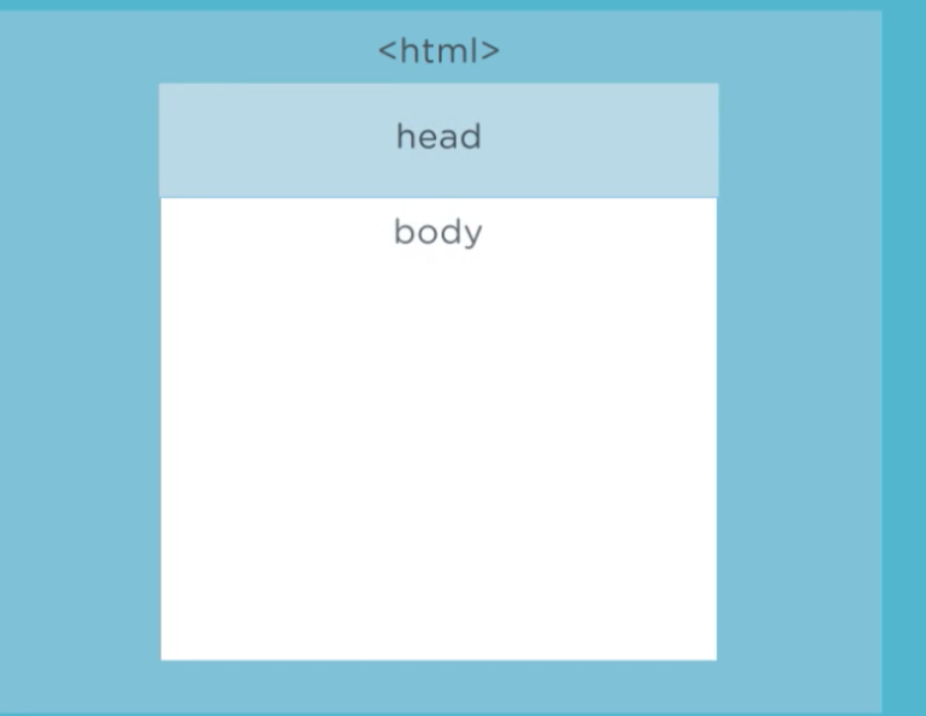
Everything on a page is inside <html></html> tags except for the doctype declaration.
Head = Behind the scenes info
Body = The stuff that shows up in the browser
One standard organization of the body a web page:
– Header – a container for introductory content or a set of navigational links.
– Main – The main content area consists of content that is directly related to or expands upon the central topic of a document, or the central functionality of an application.
– Footer – typically contains: authorship information; copyright information; contact information; sitemap; back to top links; related documents
CSS
Comments
You create comments by using /* */.
Cmd-forward-slash is often a comment shortcut key for Mac text editors.
Purpose
Lets you make styling/presentation changes en masse by just editing a CSS stylesheet rather than making lots of changes to individual elements of a web page.
Ways of Styling Pages
In-Line
You can actually style stuff in-line e.g. the style attribute in the h1 tag below:
|
1
2
|
<h1 style="color: white">Lake Tahoe, California</h1>
|
But this is considered bad form and kind of defeats the purpose of using CSS in the first place, since to make changes later you’ll have to edit the actual HTML…
Internal
Internal styles are embedded in the <head>section of the HTML document and are defined inside a <style> tag.
|
1
2
3
4
5
6
7
|
<style>
p {
font-size: 20px;
font-weight: bold;
}
</style>
|
Drawback is that changes you make will only affect that web page.
Both in-line and internal can be useful for testing or very small projects.
Linking an External Stylesheet File
Can style multiple HTML pages with a single sheet with this method.
Can use multiple stylesheets in a single HTML document.
Must link stylesheet in HTML. Best practice is to do this in the <head> tag. And you would do this using something like <link rel="stylesheet" href="css/style.css">.
Using an @import Statement
This can import the content of another stylesheet into current stylesheet or HTML file. Has to appear before other styles to work properly.
Purpose of Importing
Can make CSS more modular by letting you import different styles. However, more imports means more requests to the web server, and this can affect performance.
Classes
Classes can be used to style only tags with the relevant class attribute rather than every <p> or whatever. You use a . dot before the class name in the css file in order to indicate that you’re styling a class.
Properties
A CSS property is a characteristic (like color) whose associated value defines one aspect of how the browser should display the element.
Selectors
CSS Selectors are what target the tags on a web page for styling purposes.
In the example below, h1 is the selector and the rest (the highlighted portion) is the declaration block.
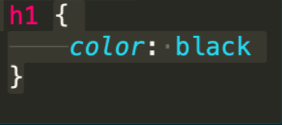
The structure of the declaration block is a property and a value followed by a semicolon, and with the entire block surrounded by curly brackets. Multiple values can be used inside a declaration block.
Universal Selectors
Universal selector is \*, very powerful, gotta be careful with it, affects every element on a page.
Element/Type Selectors
Type selectors target element types on the page. They’re also called element selectors because we use the element’s HTML tag as the selector.
ID Selector
The ID selector uses the id attribute of an HTML element to select a specific element.
An element can only have one ID at a time.
ids can only be used once. You cannot have more than one element with the same ID in an HTML document.
To select an element with a specific ID for styling in a stylesheet, write a hash (#) character, followed by the ID of the element. E.g. the following will select elements which have the ID primary-content.

Another function of ids is to create landmarks/anchors within a page. E.g. you can give a header the ID top and then link to that ID with a href to #top.
Class Selectors
Class selectors let us target elements based on their class attribute. The main difference between a class and an ID selector is that ids are unique and they’re used to identify one element on the page, whereas a class can target more than one element.
Class selectors use a dot notation:
And you set a class attribute in the html file:
![]()
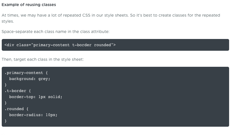
Reusing classes
Class selectors can target multiple elements, as already mentioned. You can also have an element with multiple classes. Example:
![]()
Using Class Selectors & ID Selectors Together
You can use both an ID and class on an element. However, the styles define in the ID selector carries more weight than styles defined in classes, cuz ID selectors are more specific.
Descendent Selectors
CSS lets us target elements based on their relationship in the HTML document. We can combine selectors to create descendant selectors that target elements that are descendants of an element. This makes our selectors more specific.

Pseudo-classes
Pseudo-classes are similar to classes, but they’re not explicitly defined in an element’s class attribute. Unlike type, ID and class selectors, pseudo-classes can target elements dynamically based on user interaction, an element’s state, and more.
Per Mozilla Developer’s Network,
A CSS pseudo-class is a keyword added to a selector that specifies a special state of the selected element(s). For example, :hover can be used to change a button’s color when the user’s pointer hovers over it.

Think of a pseudo-class as a keyword we add to a selector to style a special state of an element.
Example: The :link pseudo-class targets links that have not been visited by the user:

Common Data Types
A data type is a type of CSS value.
Colors are an example of a data type.
Integers, numbers, and percentages are other common data types.
Images are another data type.
Length Units
Pixel Units
Absolute, don’t scale.
CSS “px” is an abstract reference unit, is not based on actual size of pixels on a device. Higher pixel density displays will rescale pixel values.
Relative Units
Relative length units are relative to other length values.
em unit
The most commonly used relative unit is the em unit. The em is known as a font-relative unit because it’s calculated based on a parent element’s font size.
1em = font-size value of parent element.
Default font size value for most browsers is 16px.
If we set our body’s font-size value to 1em:
|
1
2
3
4
|
body {
font-size: 1em;
}
|
This is equivalent to setting the font-size value to:
|
1
2
3
4
|
body {
font-size: 16px;
}
|
Tangent on parent element from a Treehouse comment. Somebody asks:
In the beginning, Why the relative value’s parent is “body”? when we change title size, it based on the size of body?
and they get the reply:
The element with the class of “title” is a
<span>that has the<header>as a direct parent. It is in turn a child of the<body>element. The reference for font size is always based on the direct parent, but in a case of nesting like this, the properties are passed down from level to level.So while the body isn’t the direct parent, changes made to it would affect the “title” span as long as they were not overridden in the immediate parent (the header).
This is elaborated in the video. The instructor changes the body font size and the title size with an em font-size scales up accordingly.
rem unit
The rem unit is similar to the em unit. The difference is that rem is relative only to the root element of the page. This gets us around the compounding font size issue we experience with em units.
Which one should we use?
– Pixels are more precise, easier to understand, and predictable
– Use %, em, or rem for designs that need to scale and adapt fluidly across different devices and screen sizes
Styles/Values/Properties
Color values
Color plays an important role in web design. With CSS, we can describe a color value in different ways. The three most common ways are with a keyword, a hexadecimal value, or an RGB function. You can also use RGBa values for transparency.
Hexadecimal values.
|
1
2
3
4
|
.main-header {
background-color: #ff0033;
}
|
Hexadecimal values can be abbreviated to 3 characters if the characters are 3 sets of identical pairs as in the example above. You could therefore represent the above value as #f03.
RGB Values
|
1
2
3
4
|
a:link {
color: rgb(255, 169, 73);
}
|
RGBa Values
|
1
2
3
4
|
a:hover {
color: rgba(255, 169, 73, .4);
}
|
Text Styles
Text has a significant effect on how we view a web page.
text-align
Let’s us control the horizontal alignment of text.
text-transform
Changes the case of text – whether it’s uppercase, lowercase, or capitalized.
text-decoration
Sets the line decoration of elements. We’ll commonly use this property to remove underlines in links.
font-weight
Sets how thick or thin the characters are displayed. Some fonts let you use numeric weights from 100 to 900. Whether you can make use of these values depends on the font.
Font Properties
Like text properties, font properties let us change the appearance of text by assigning a font family, font size, font style, and more.
There are two types of font-family names. Names of specific family (e.g. Helvetica) and a generic family name (like monospace).
CSS font stacks are prioritized lists of fonts that the browser will cycle through until it finds a font that is installed on the user’s system. You need a list because not everyone has all the same fonts installed.
font-family
Defines a typeface for our text.
font-style
Allows italic or oblique faces to be selected within a font family.
Line Height
With the line-height property, we can increase, or decrease, the vertical gaps between lines of text. Line-height properties generally just use a number and don’t specify units.
We’ll commonly use the line-height property in the body element to set the overall line-height of the page. For example:
|
1
2
3
4
|
body {
line-height: 1.5;
}
|
The browser multiplies the font size of each element by 1.5 to determine their line height.
font
A shorthand property that lets us write all the font properties in one value.
|
1
2
3
4
|
body {
font: normal 1em/1.5 "Helvetica Neue", Helvetica, Arial, sans-serif;
}
|
Box Model
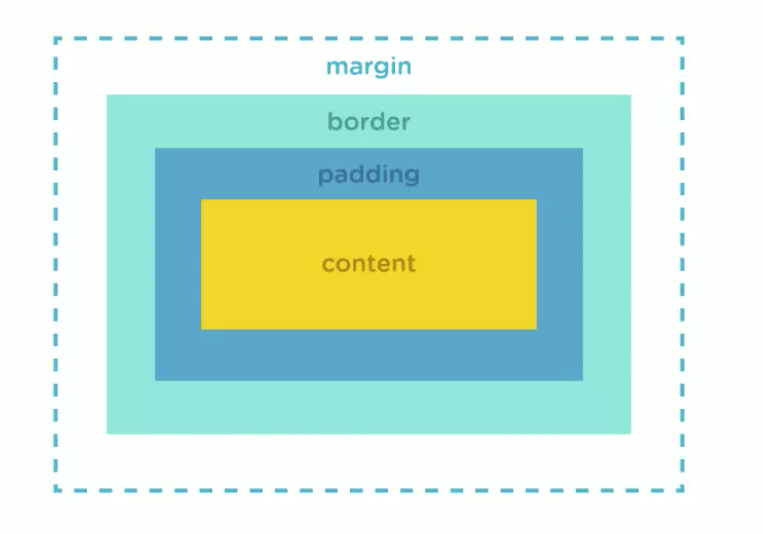
Each element on a page can be thought of as a rectangular box that takes up a certain amount of space.
Elements are displayed two ways. Every element has a display value, depending on what type of element it is.
Padding vs. Margin
Padding
Keeping box model in mind, padding is space between element and the border of the “box” for that element. E.g. if you have some text with a border around it, adding some padding will increase the amount of space between the text and the border.
No padding set for this specific element (there might be some default padding values, I dunno):

5px of padding for this element:

20px of padding:

Defining Values
We can define values for padding as any length or a percentage unit. There are two ways we can set the values for padding. The first way is setting each property individually:
|
1
2
3
4
5
6
7
|
.wildlife {
padding-top: 100px;
padding-right: 120px;
padding-bottom: 50px;
padding-left: 20px;
}
|
We can also use the shorthand property for padding, which lets us set the padding on all four sides in one declaration:
|
1
2
3
4
|
.wildlife {
padding: 100px 120px 50px 20px;
}
|
The order of the values is: Top, Right, Bottom, Left. Think clockwise.
Margin
Space outside the element’s box. Below I don’t have any padding set for the Background element:
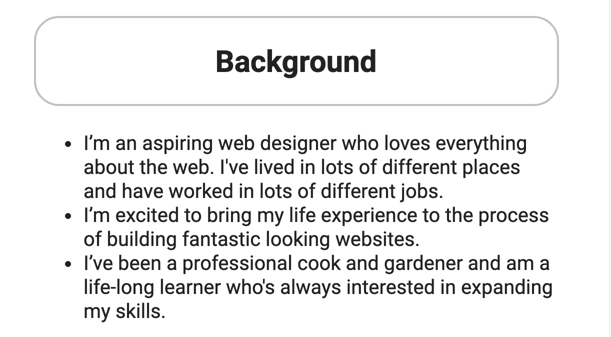
and below I have 50px margin set:
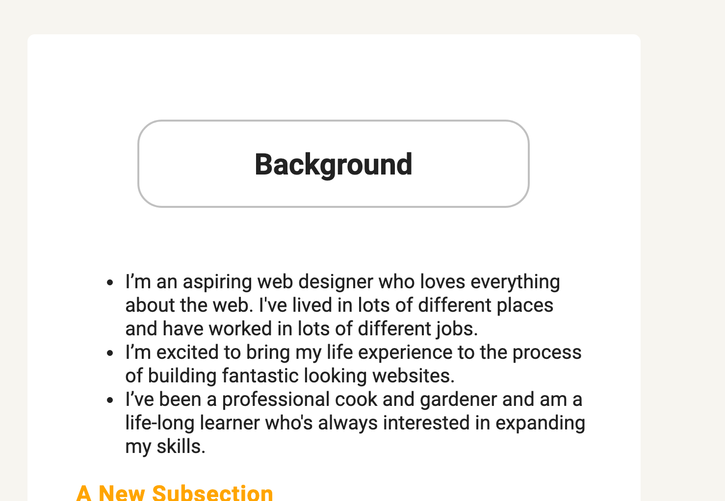
Defining Values
The same order of padding shorthand values applies to the margin property.
|
1
2
3
4
|
.wildlife {
margin: 105px 0 60px 0;
}
|
This is exactly the same as writing out the full margin declarations:
|
1
2
3
4
5
6
7
|
.wildlife {
margin-top: 105px;
margin-right: 0;
margin-bottom: 60px;
margin-left: 0;
}
|
Block elements
Form a separate block that takes up the full width available based on the width of its parent element. Creates new line before and after the element. Some examples: divs, paragraphs, heading tags, list items.
In-line elements
Only take up as much width as they need to. Don’t force new lines. Some examples: anchor elements, span tags, images.
Display Property
You can change how elements are displayed (turning links into block elements, for example) using the display property.
One notable value for display is inline-block, which is a sort of hybrid that gives an element both some in-line attributes and some block-like attributes (such as the ability to set top and bottom margins).
Borders
border-width
Sets the width of a border.
border-style
Sets the style of the element’s borders.
border-color
Sets the color of a border.
border
Shorthand property for setting the individual border property values in one place.